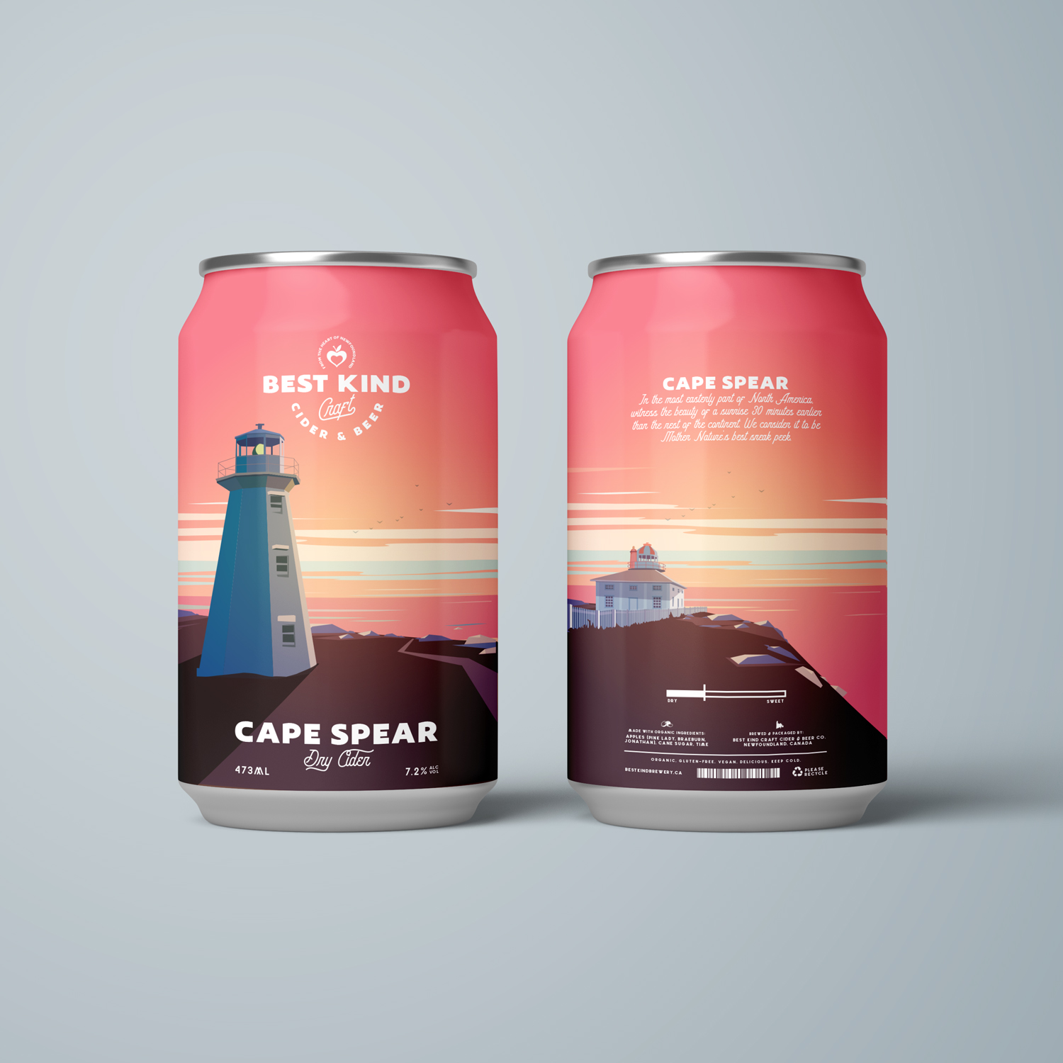
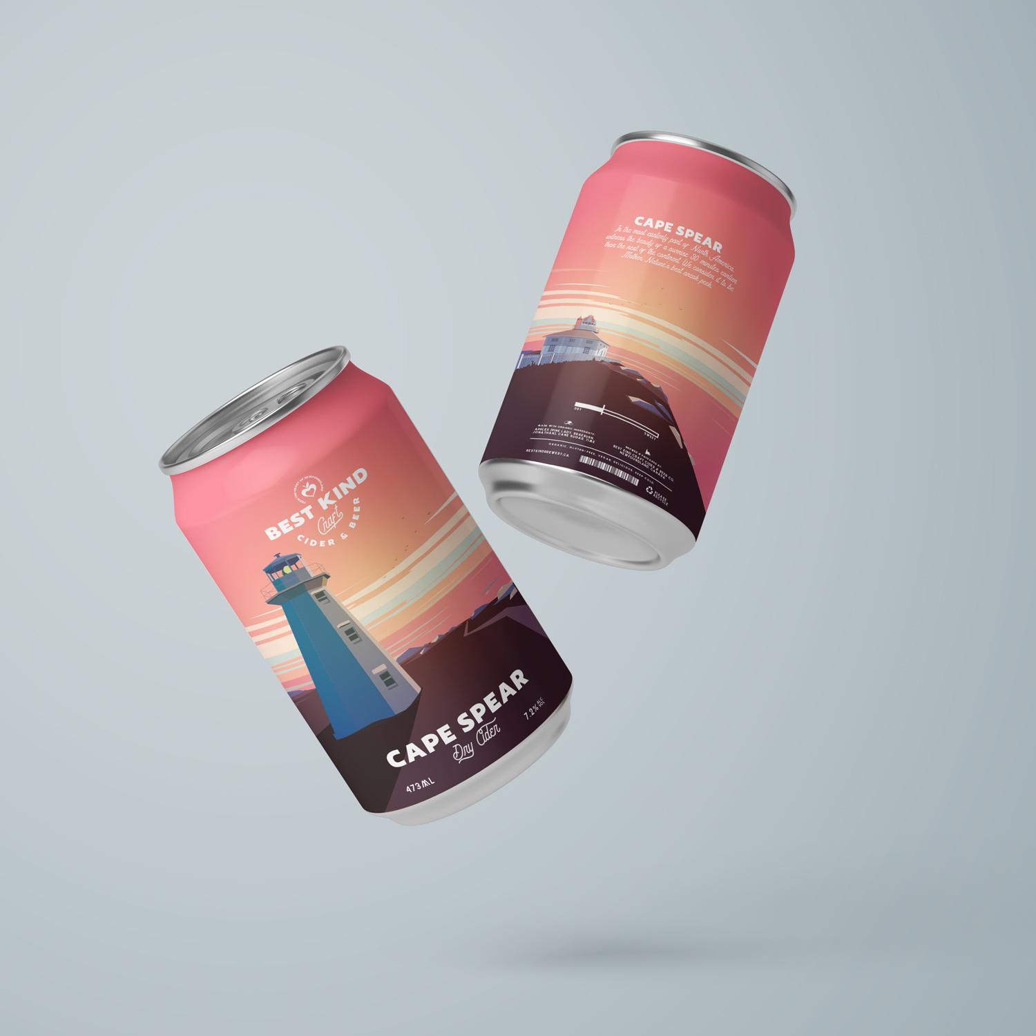
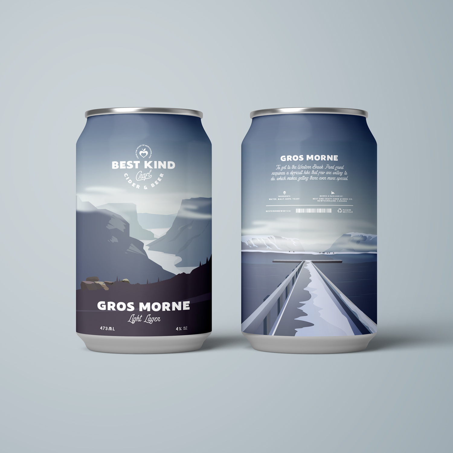
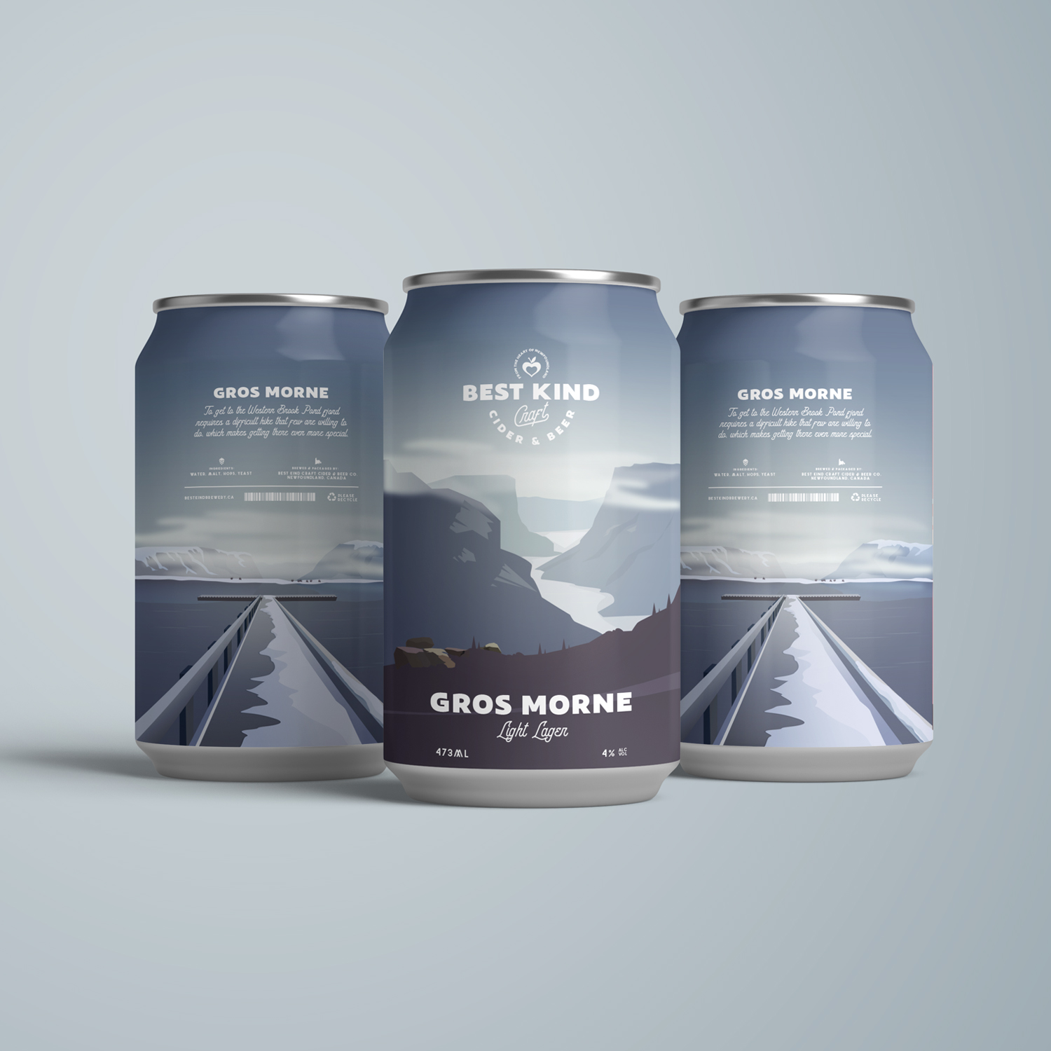
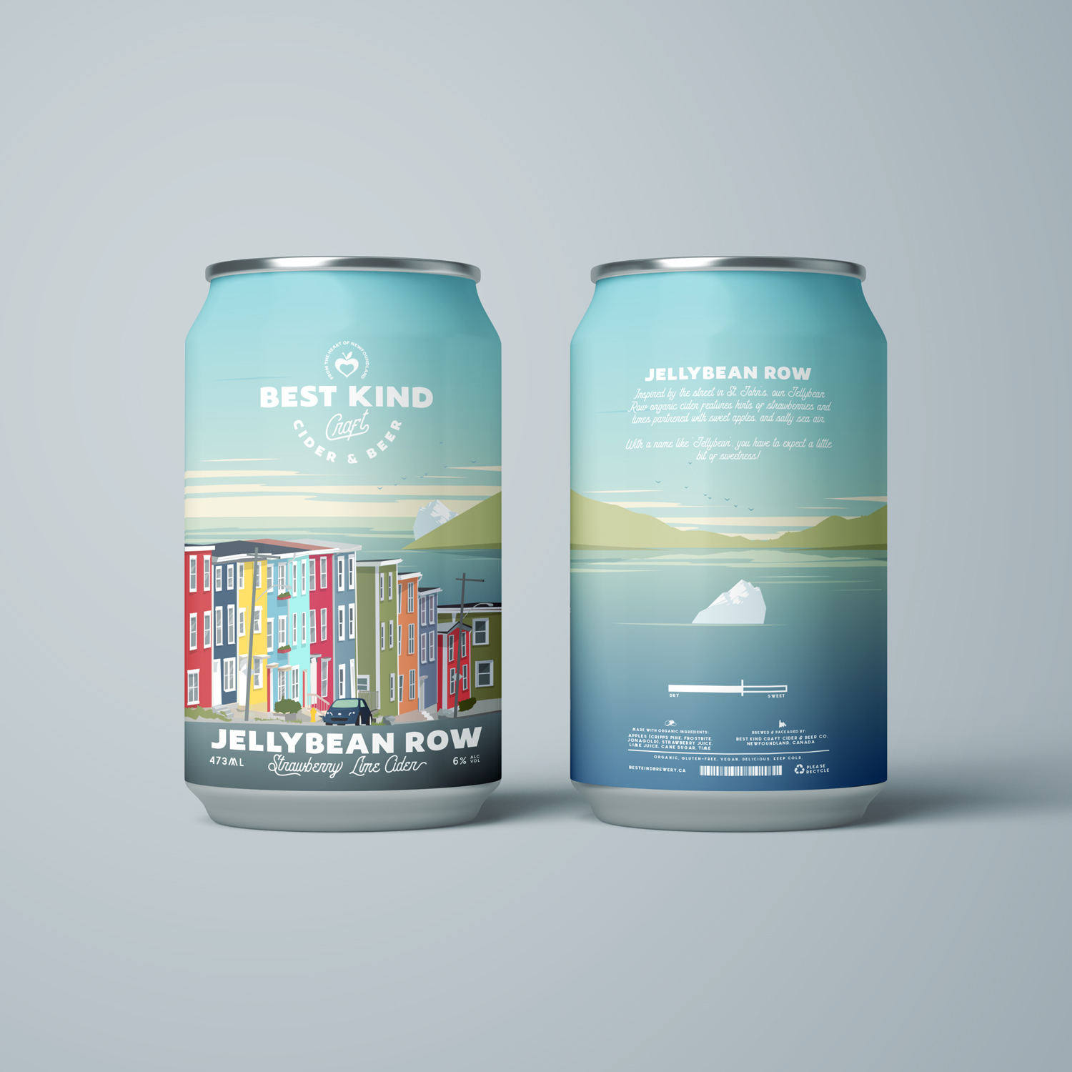
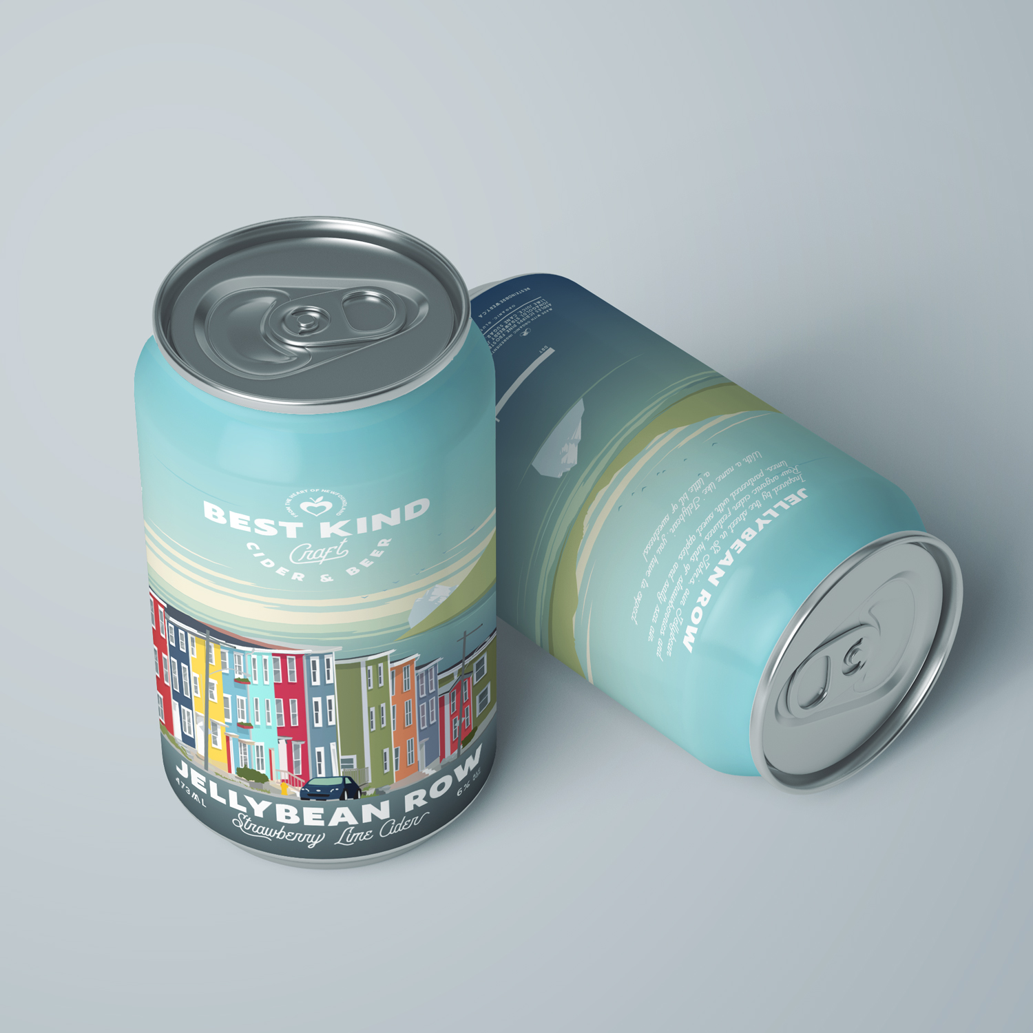


While planning a trip to Newfoundland this past fall, I was particularly struck by the fabulous names for many of their towns, such as ‘Heart’s Content’, ‘Paradise’, and ‘Come By Chance’, and the intriguing history that went along with them. As a lover of packaging for craft beer and cider, I decided on a self-initiated project to create a brand identity for a Newfoundland brewery and design cans based on some of the places I hoped to visit.
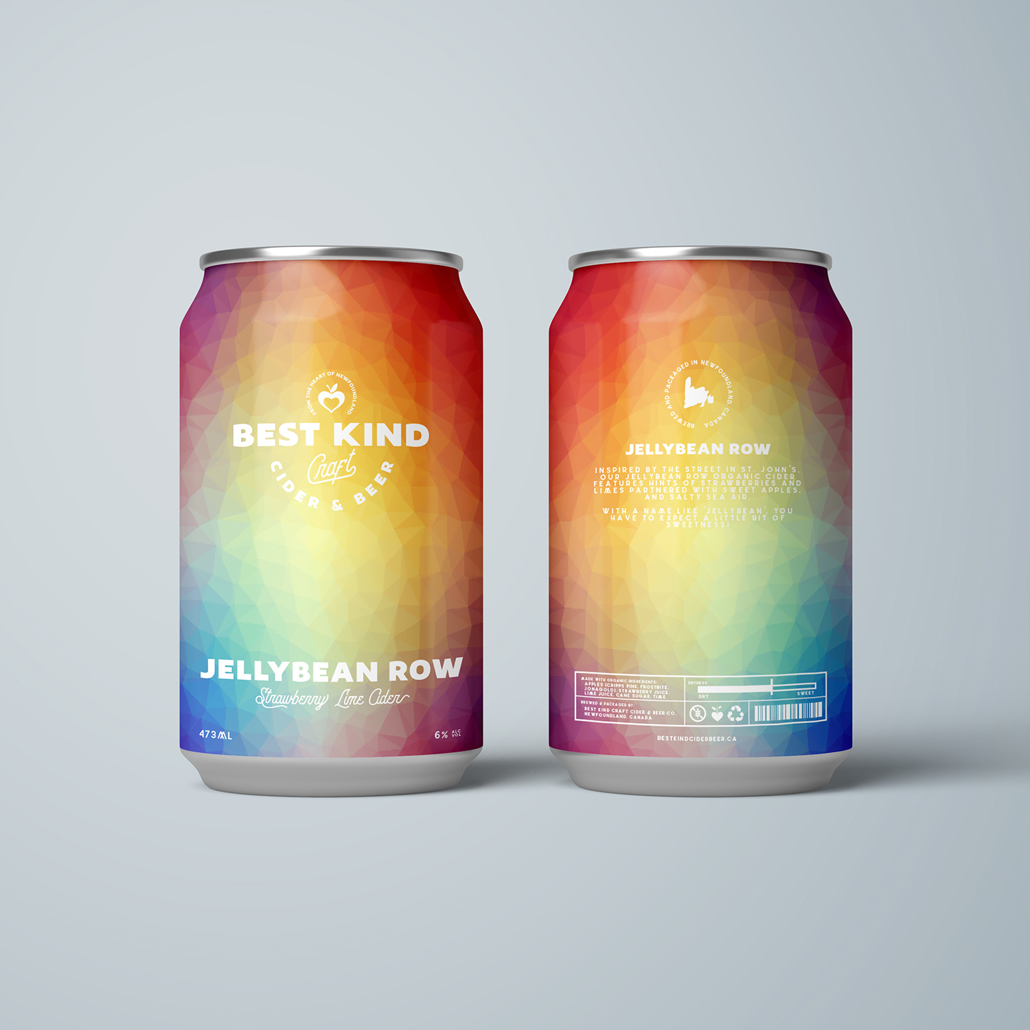
‘Best kind’ is Newfoundland slang for ‘great’, so it seemed only fitting I would name my brewery ‘Best Kind Craft Cider and Beer’. I created several illustrations using photographs of landmarks from each of the places I researched, and tried to create an aesthetic and appeal that would highlight the uniqueness of both the locations and invented drinks.
Each can comes with a short description of the place, (assuming these would be sold outside of Newfoundland), to give the buyer context for what they were looking at, as well as a dryness scale to anticipate what they were about to drink. Ingredients, a scan code, request to recycle, and various other necessities were added on the back side of the can.
Overall, this project not only helped me to take a deep dive into the province of Newfoundland, but also gave me the creative freedom to explore a little outside my comfort zone. Because alcohol packaging has so much variety – an almost ‘anything goes’ limitless type of creativity – I feel compelled to continue to push myself and try a new brand, perhaps a wine or spirits company, based on a new muse.