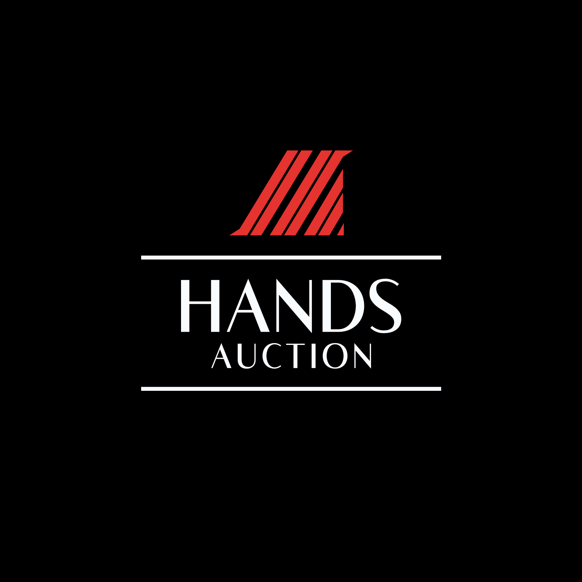


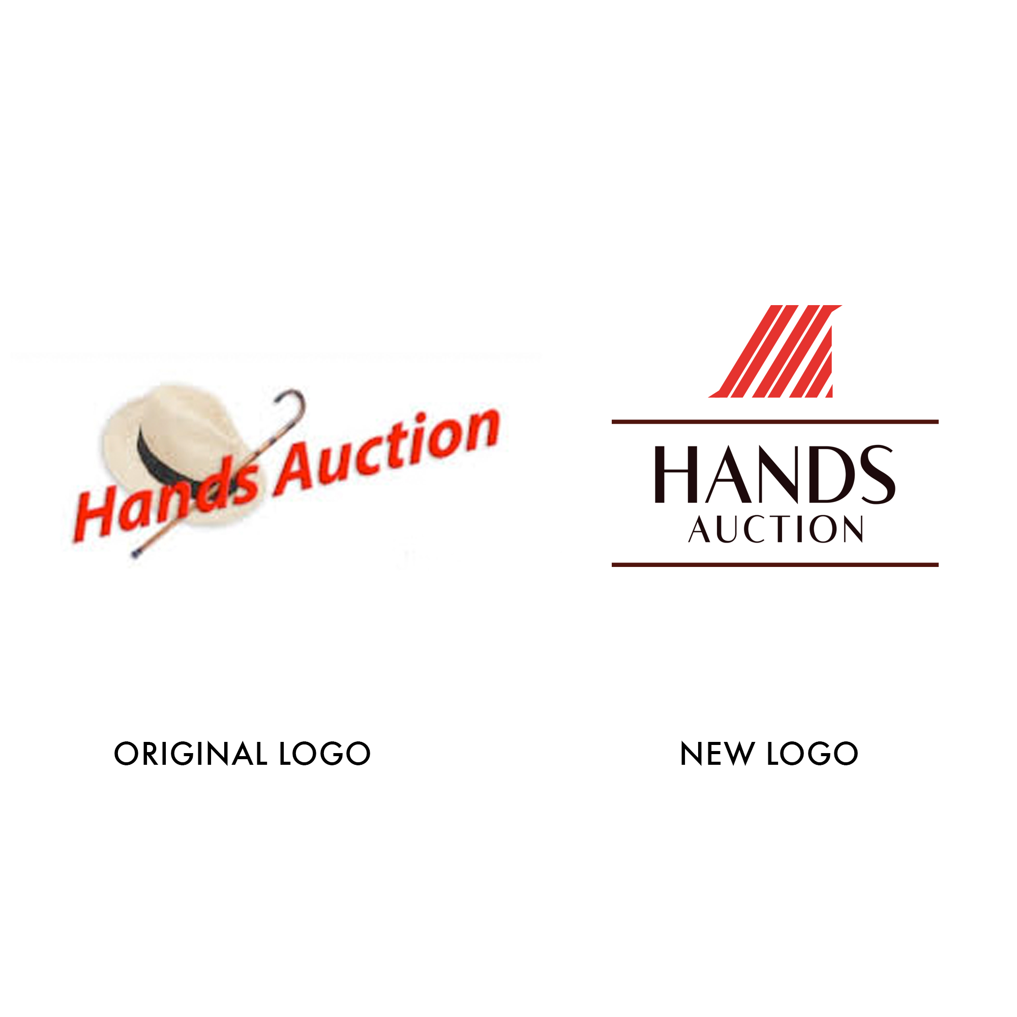
Hands Auction requested a brand refresh, leaving their old hat and cane logo behind for something more modern.
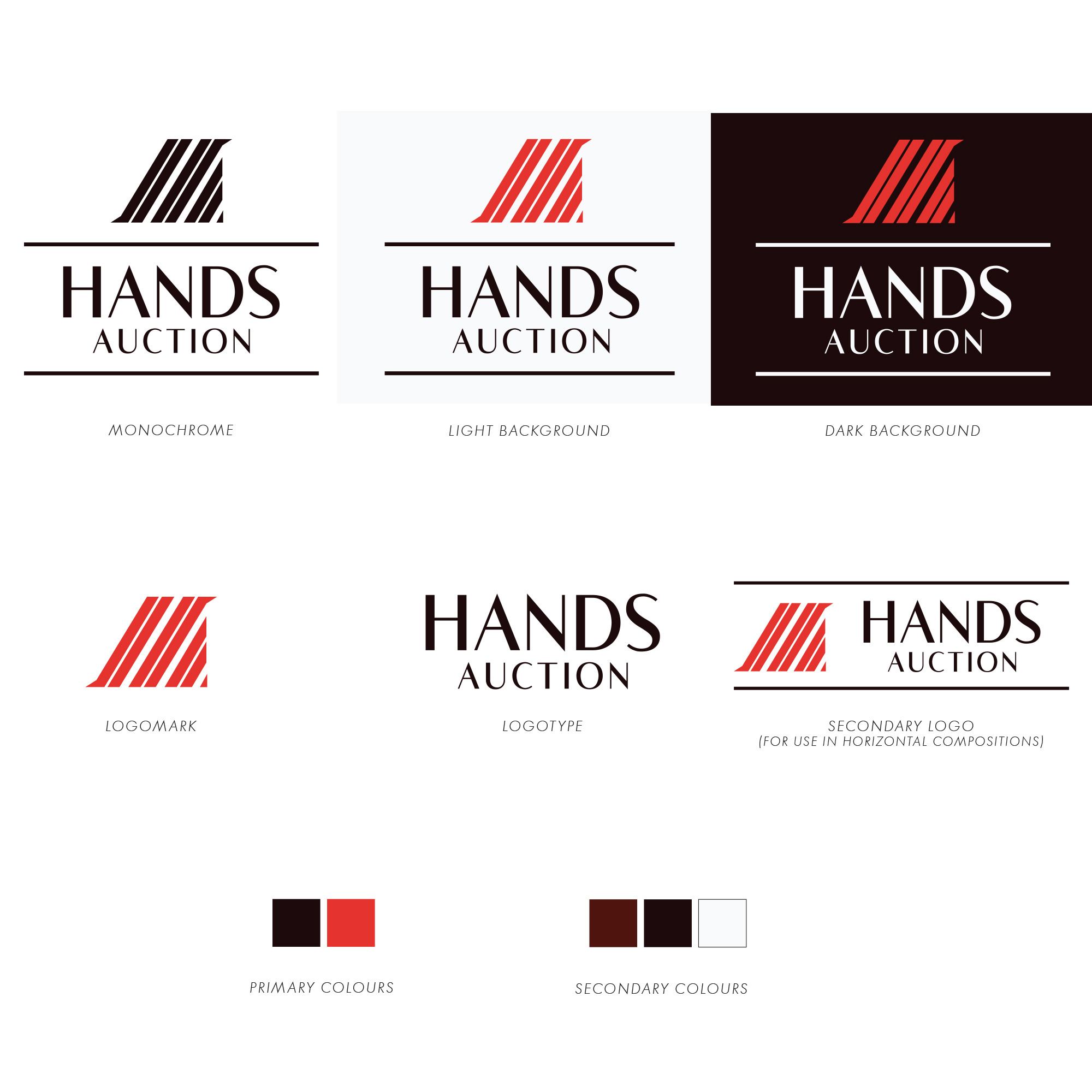
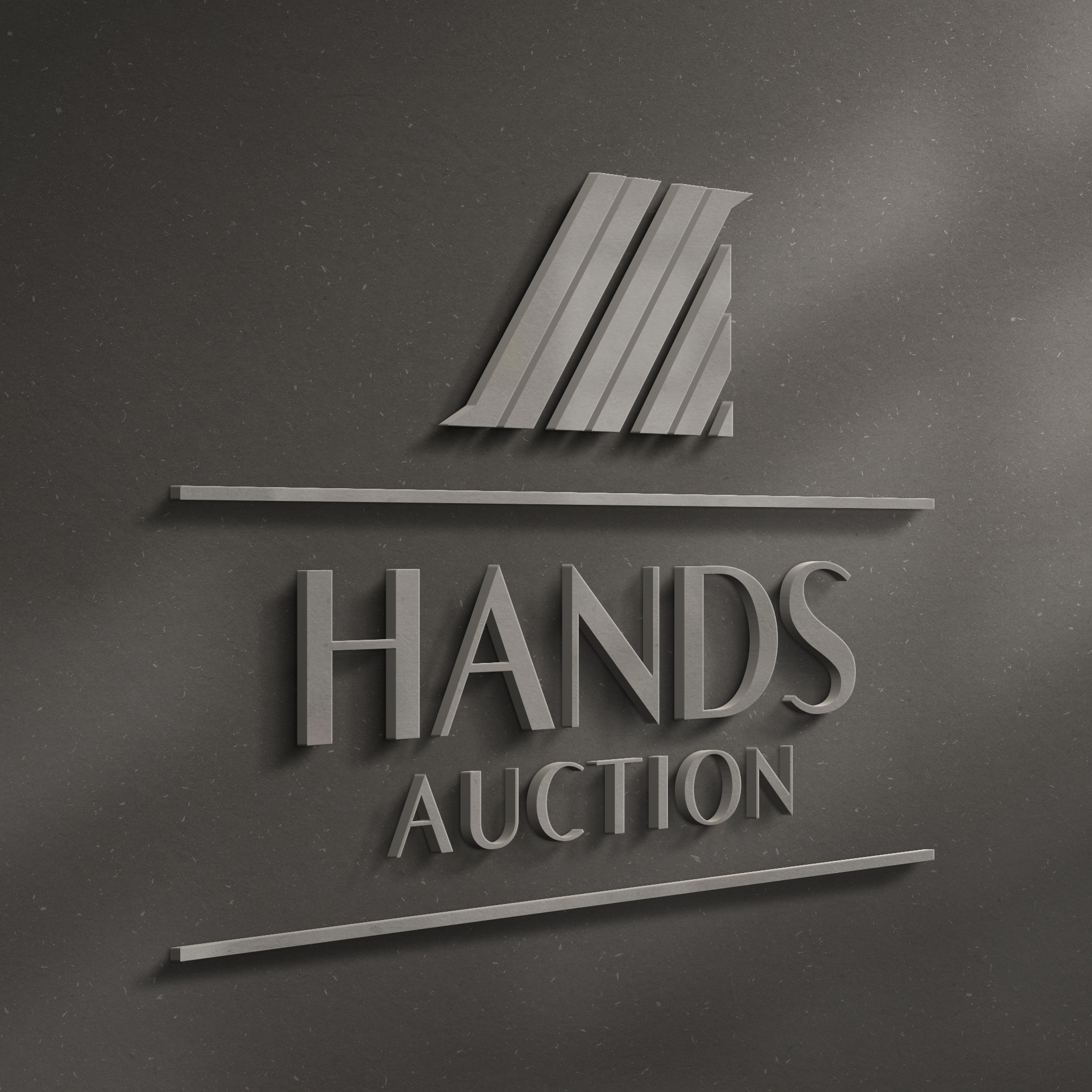
Not wanting to use any cliche auction imagery in the logo, I went a more personalized route, using the initials of the company (HA) in the logomark, and pulling imagery from ploughed fields and urban roadways to produce an icon that visually represented the diversity of the locations of their listings.
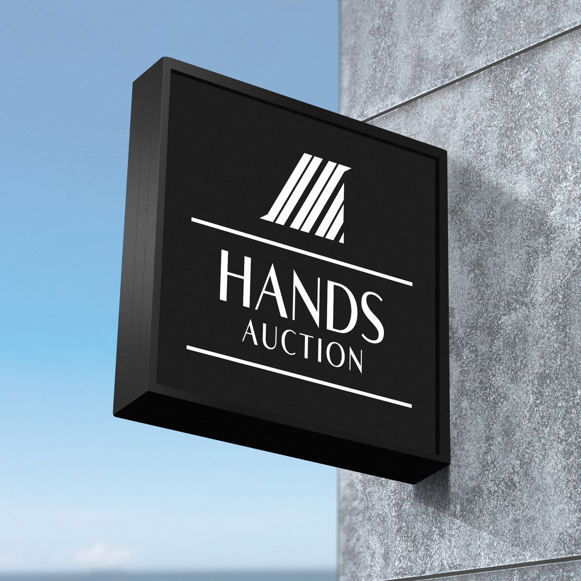
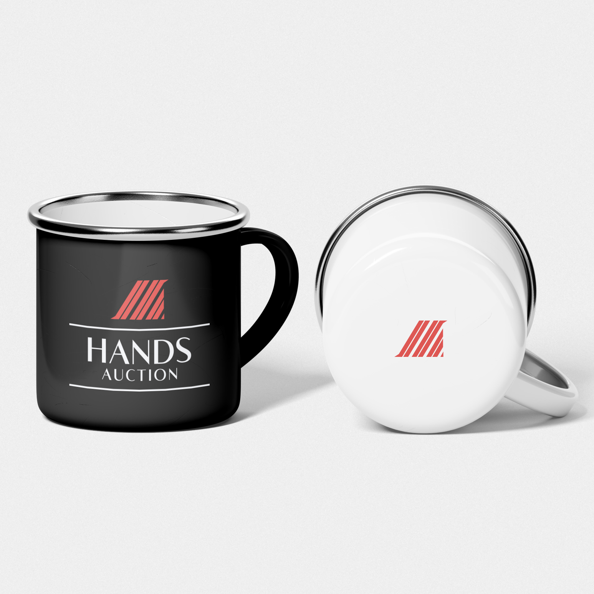
A primary and secondary colour palette and additional logo compositions were developed for a wide range of applications.
As requested by the client, the resulting design is clean, modern and professional, but still offers a trustworthy, personal feel that emphasizes longevity in and loyalty to their local community.