


Cruze Control is a craft cannabis collective in the Fraser Valley of BC. With decades of growing between them, CC are dedicated to providing high quality flower, specializing in rare, exotic strains that offer something different from widely available subpar products.
With a limited budget, I was tasked with designing a minimal brand identity that would speak to customers and vendors alike, and showcase the quality of the product contained within the various types of packaging.
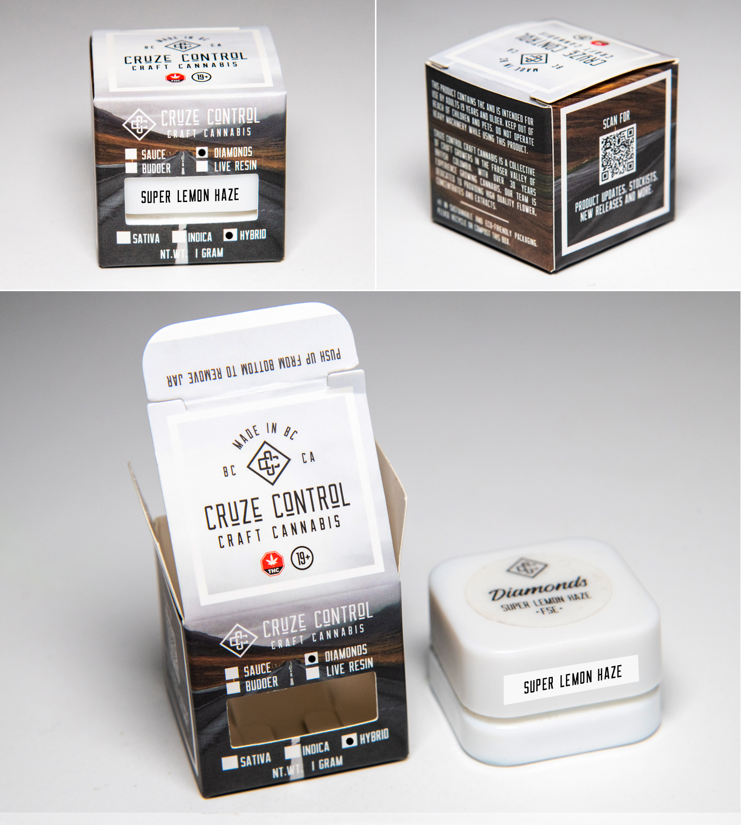
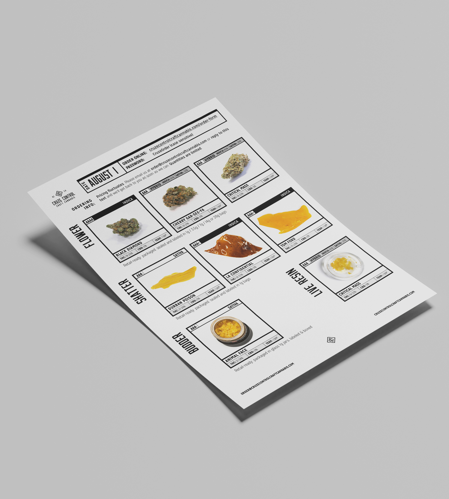
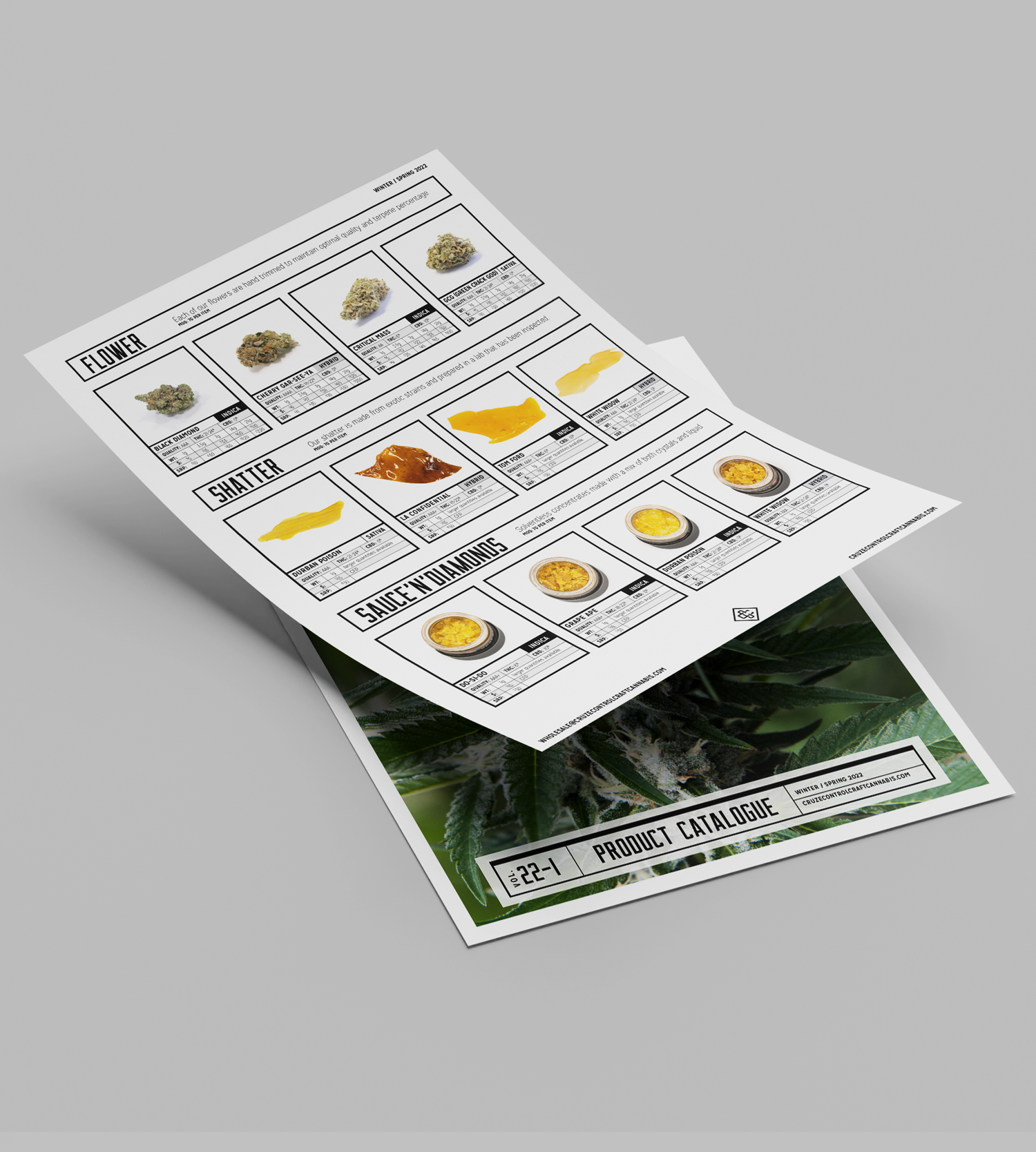
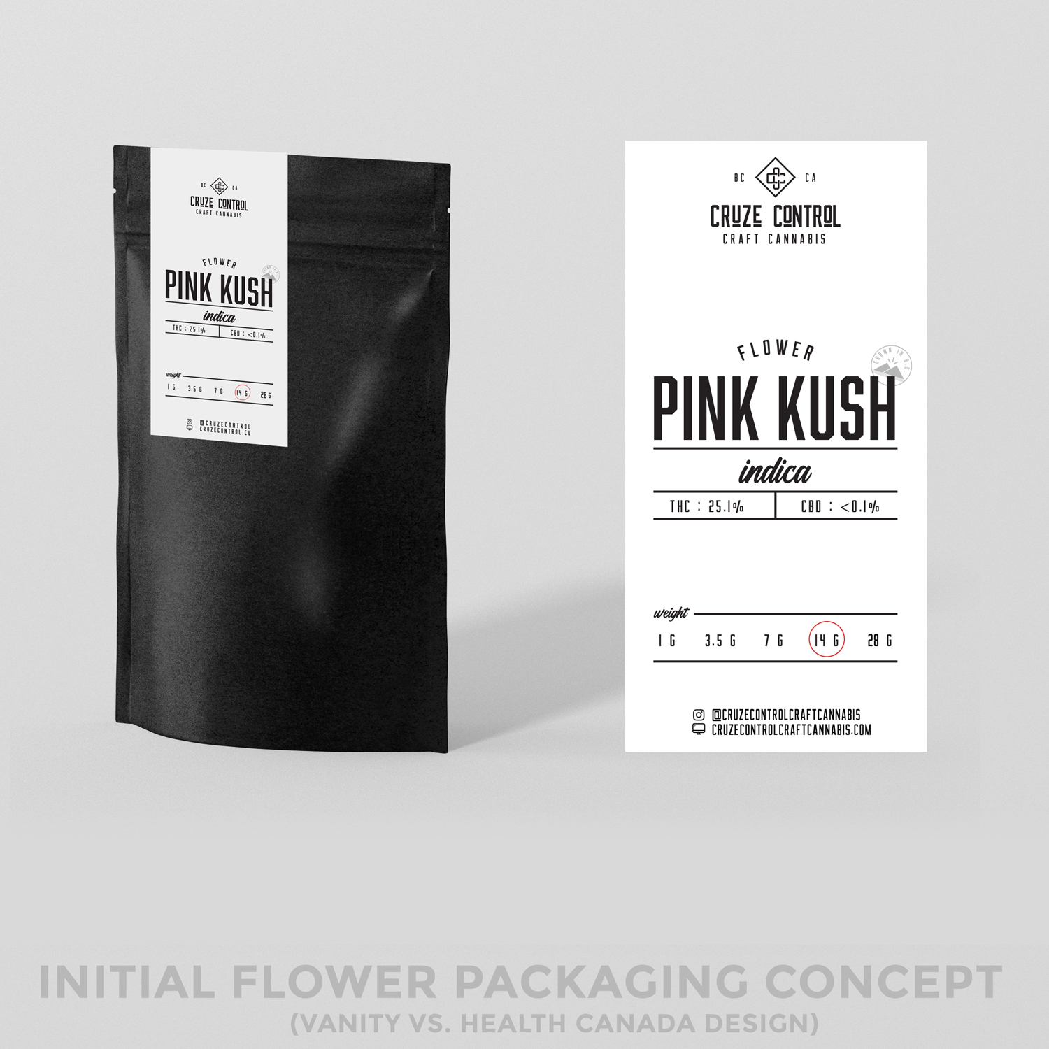
The original concept for packaging was all black and white, with bold type and boxes or charts to house product-specific information. A template for thermal labels was designed with areas for fill-ins so each product name and specs could be changed out as needed, and colours of the bags represented hybrid, sativa or indica strains.
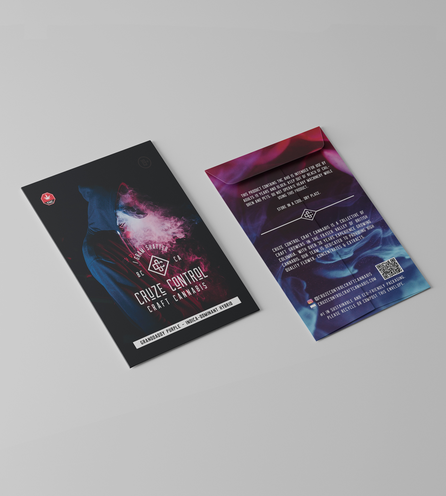
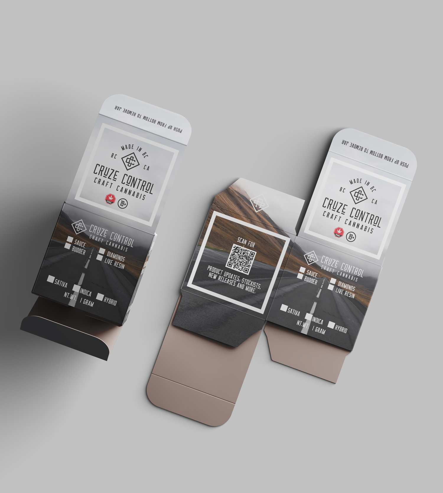
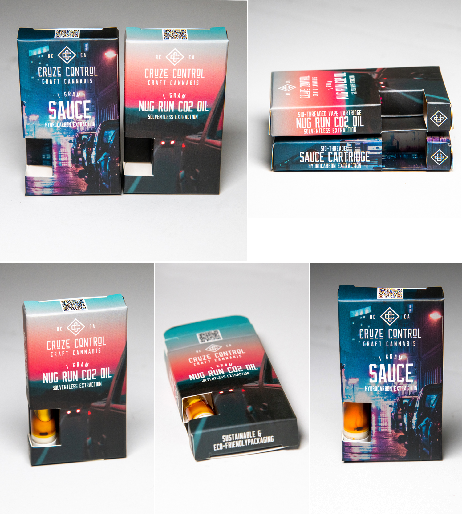
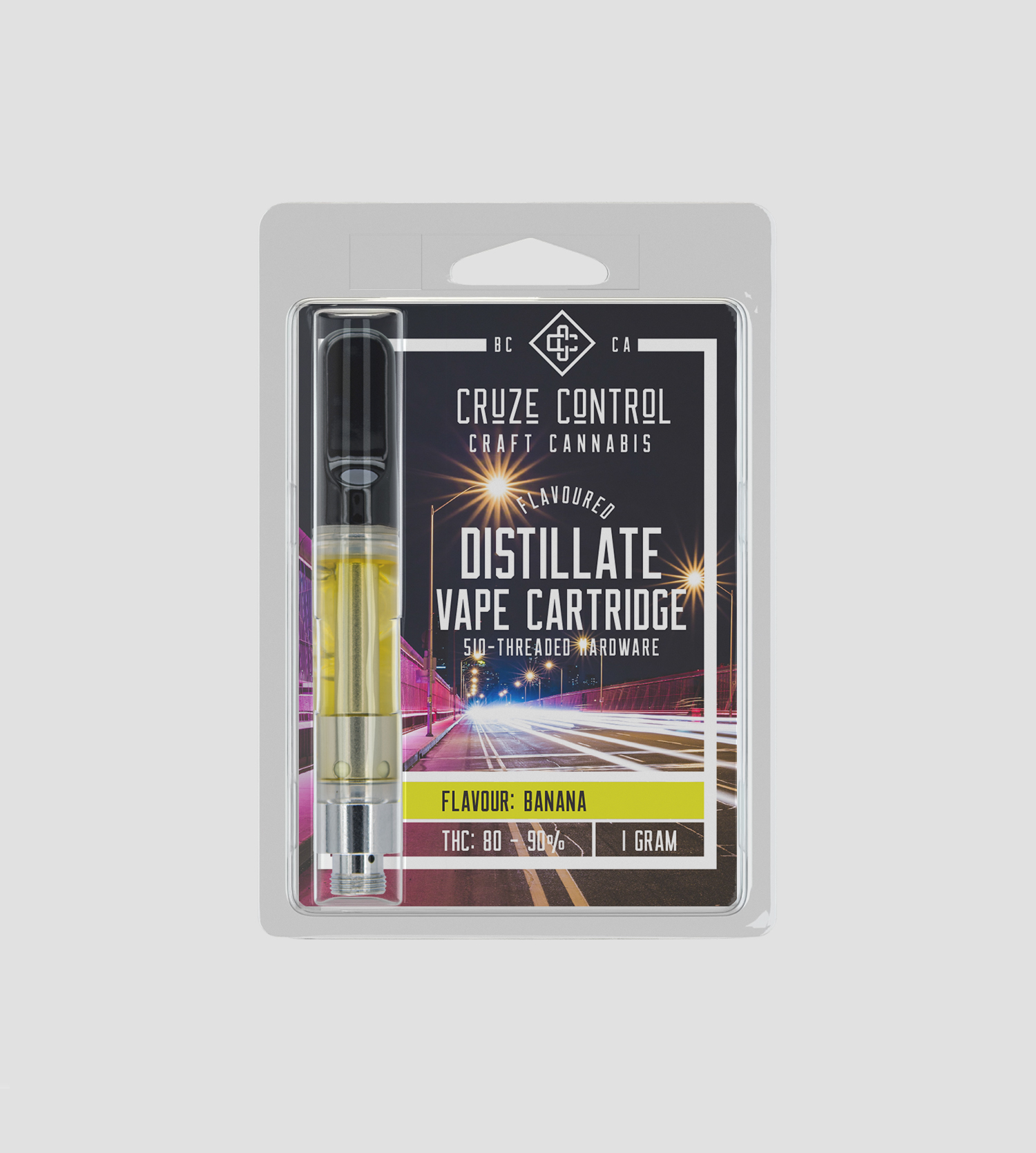
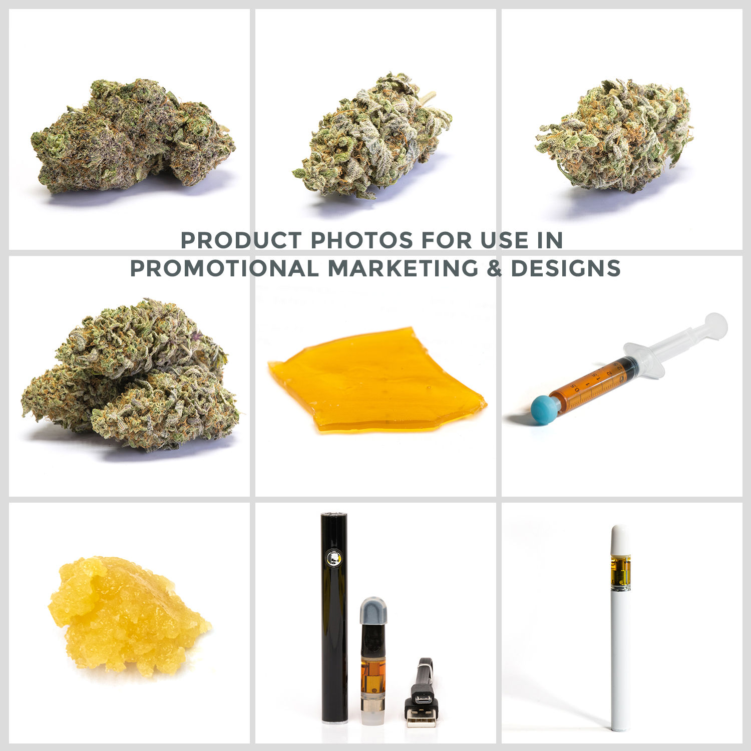
As the branding continued to evolve as more products were developed, the design style relied more heavily on photos for both colour and context, incorporating images of cars and roads with bright colours, emphasizing the ‘Cruze Control’ idea.
The website houses information about the collective and their grow methods so people can scan the QR code on the packaging and learn more about the product they purchased.
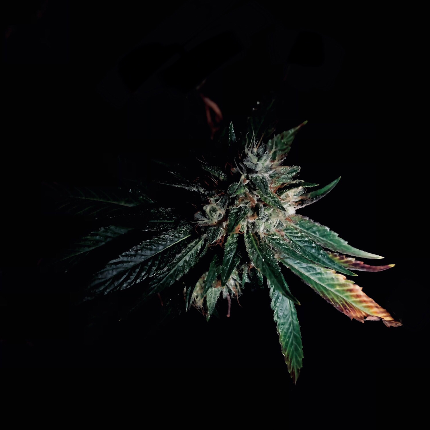
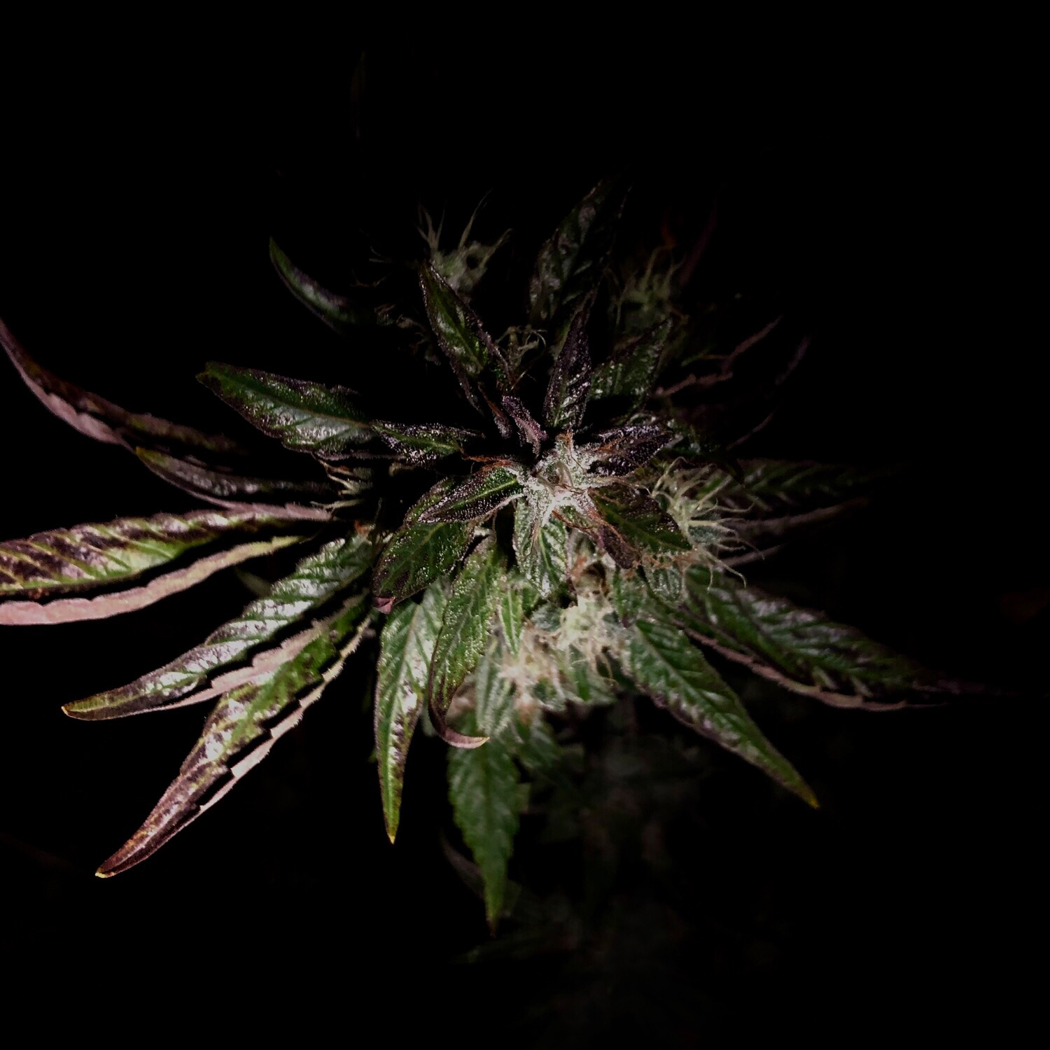
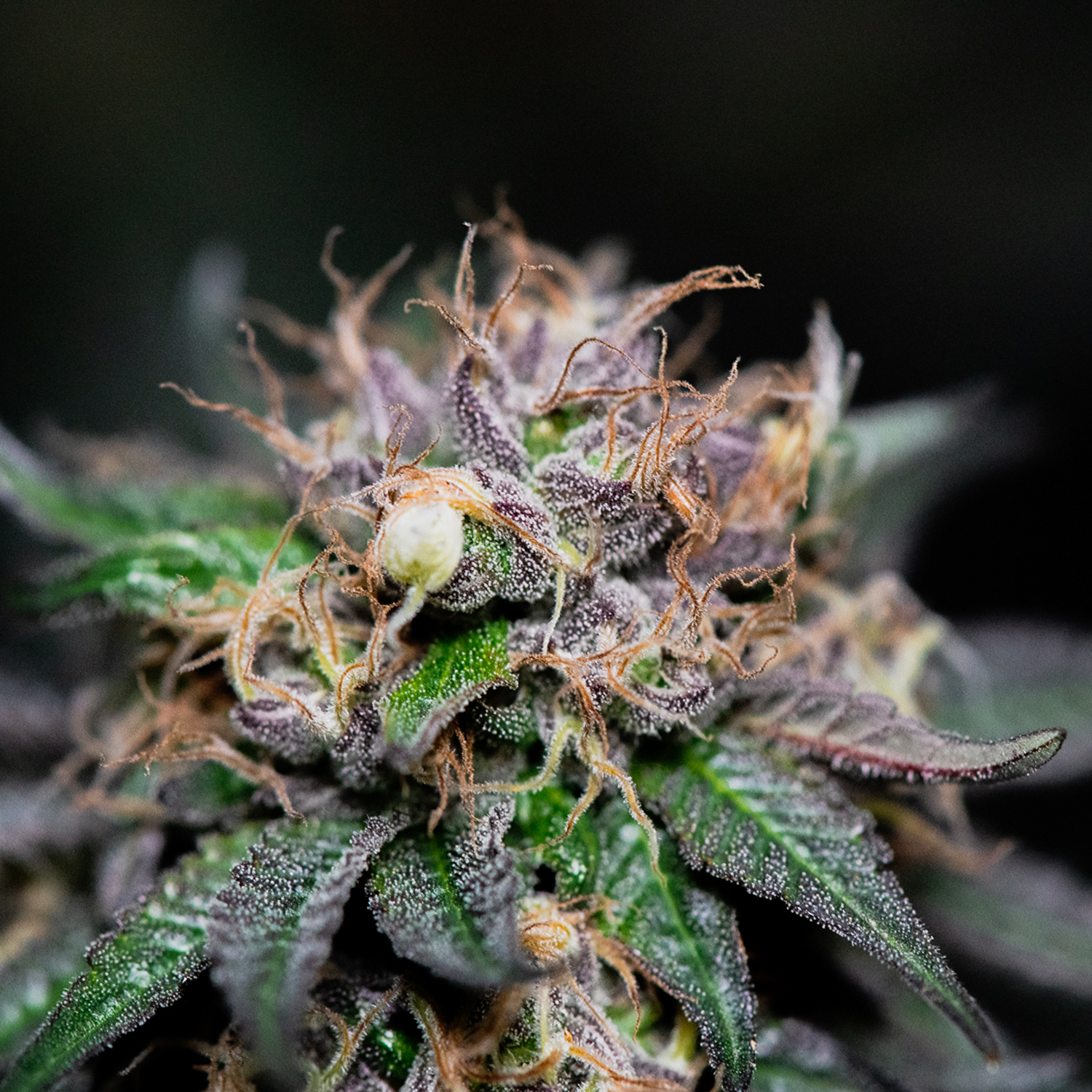
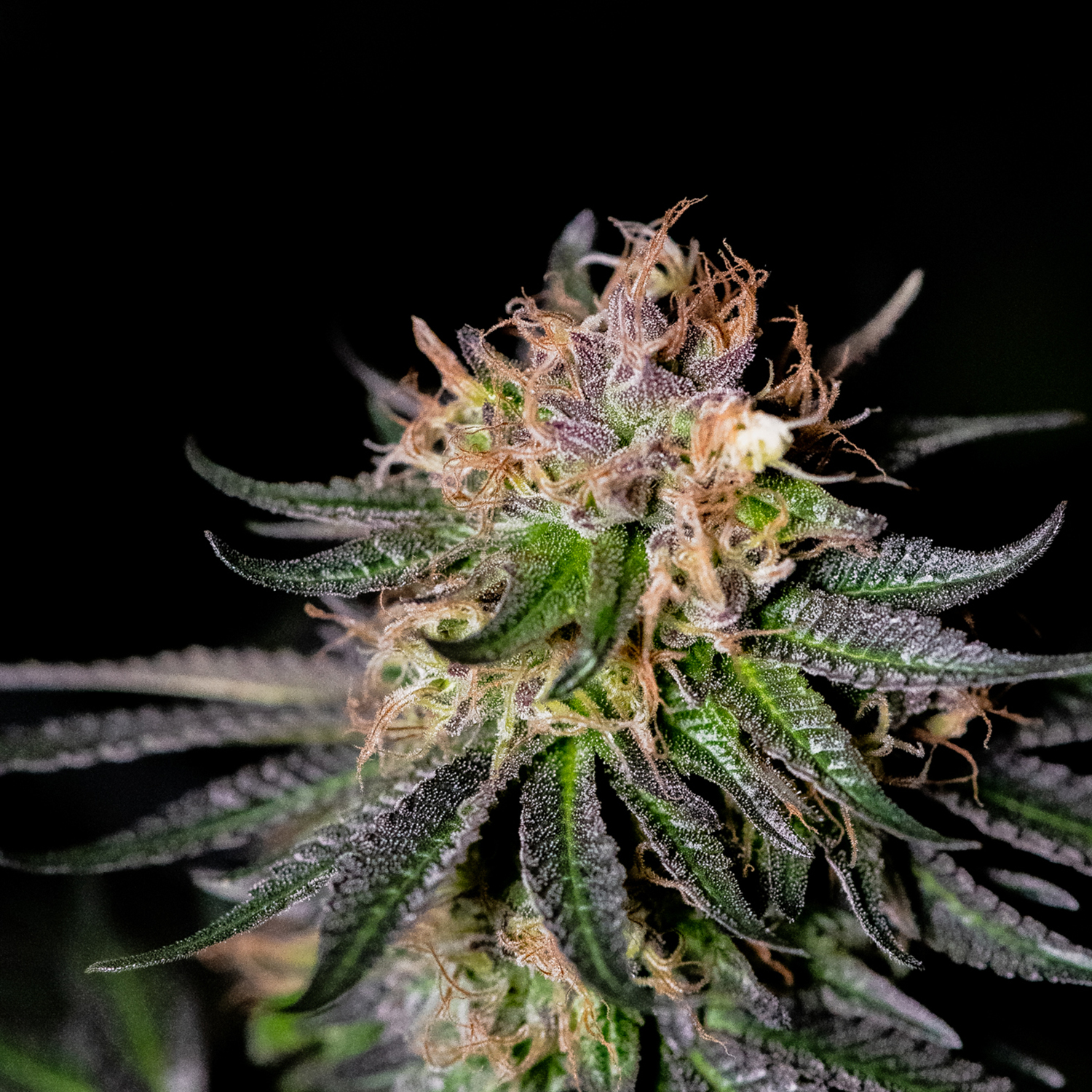
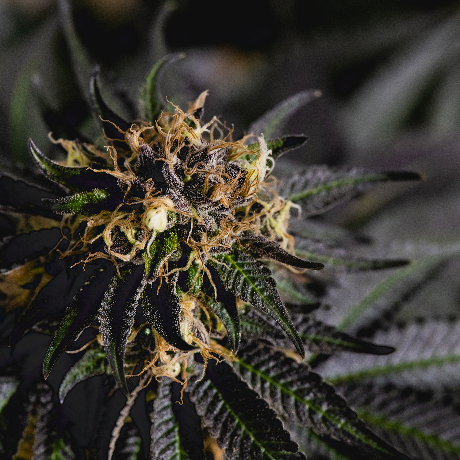
I also took photos at several of the grow locations which I used for the site and social media, and created a video for the header of the website.