


FFOM – Rebrand
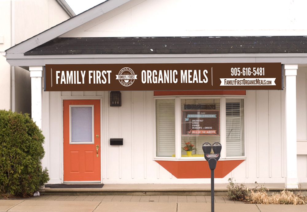
Family First Organic Meals originally started out as a division of Infant Organics, but as the family and adult food grew in popularity, the infant and toddler meals were eventually retired, and Family First became its own brand, thus requiring a fresh new look that was older and more mature while maintaining the appeal that the current and original customers had come to know and love.
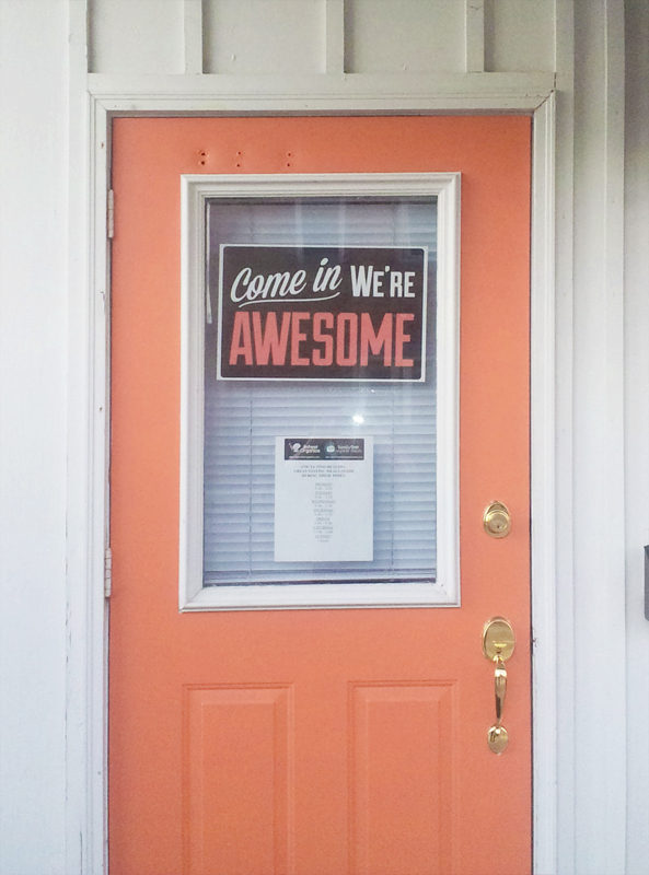
The very first printing of my ‘Come In We’re Awesome’ sign was done for Family First in an effort to catch the eye of passersby. The sign itself grew in popularity, and I eventually began producing and selling it in my online shop.
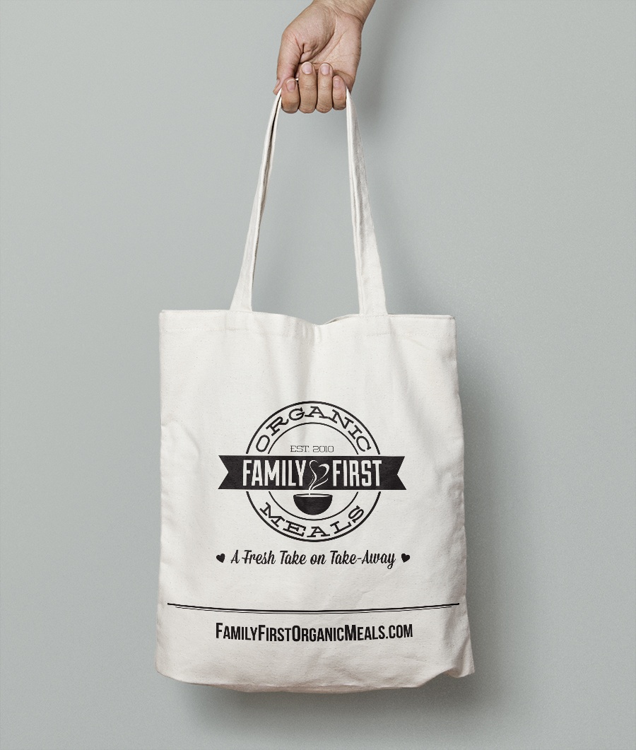
With the new branding came new marketing endeavours, including postcards advertising catering and testimonials from current happy customers. These were distributed to local businesses and suburban areas.
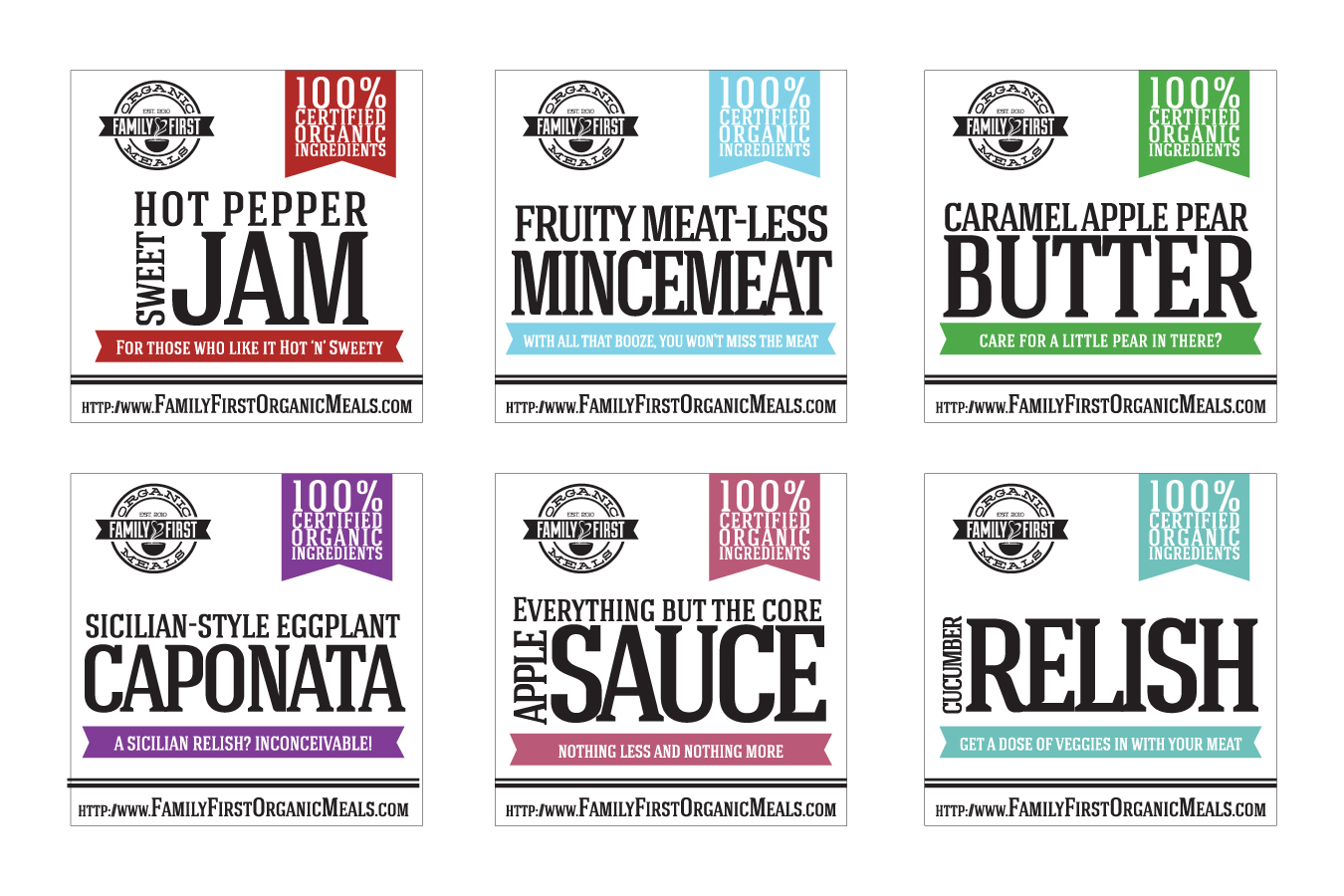
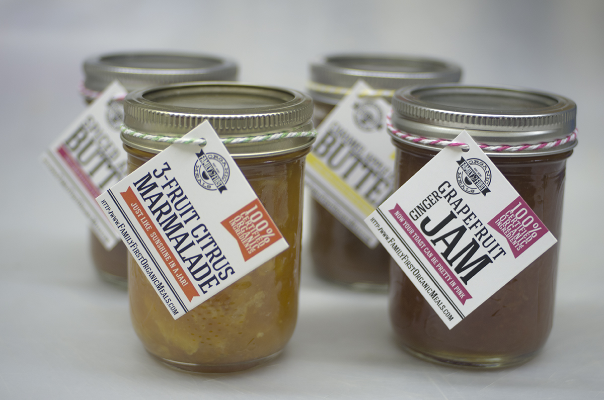
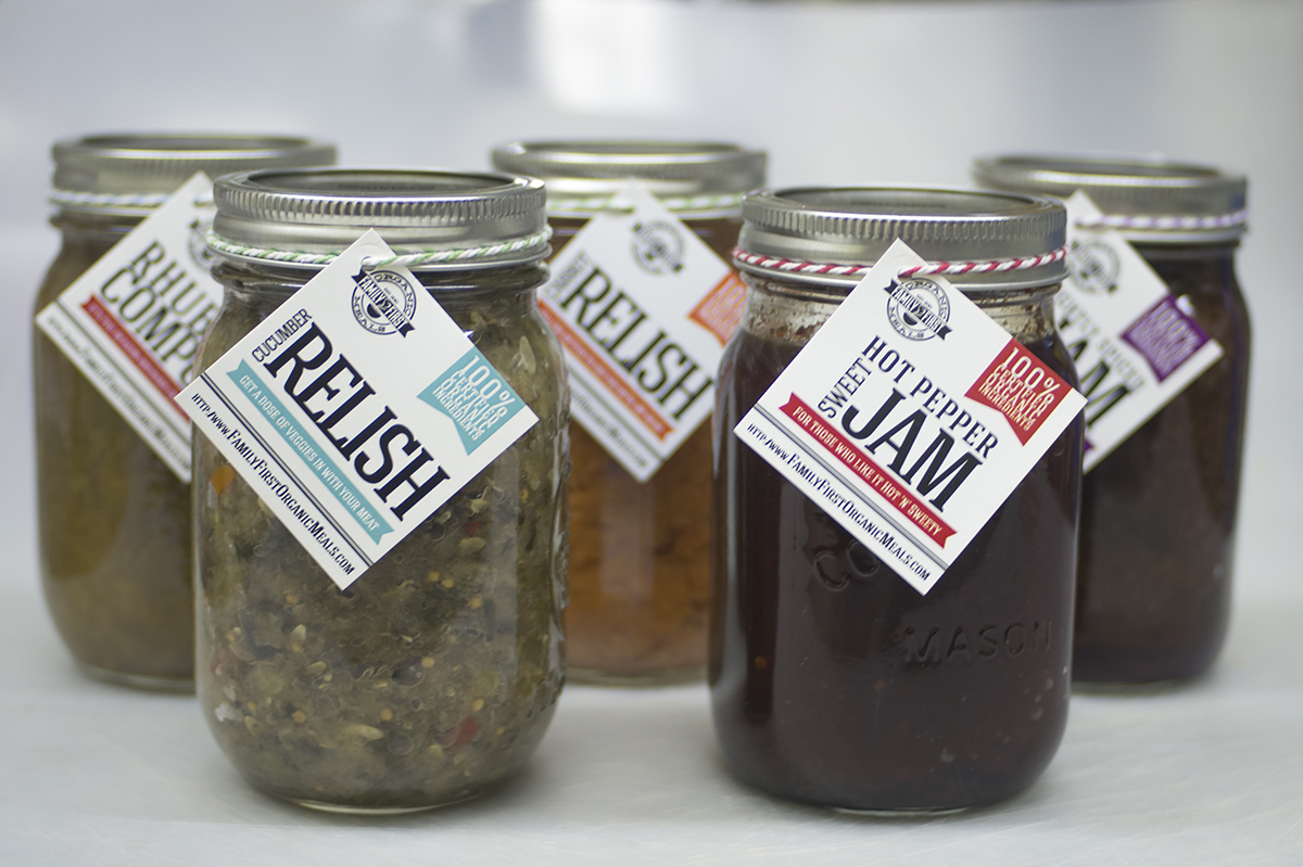
With the expansion into fresh food, a logical step was to jar and sell preserves, mustards, relishes and other sauces used on or in the sandwiches and meals sold daily at lunch. Some 2×2 tags were designed with a bold product name followed by a quirky phrase about the item in a banner below. The tags were colour coded based on the type of product it was (sweet, savoury, etc), and tied with matching baker’s twine to the mason jar.
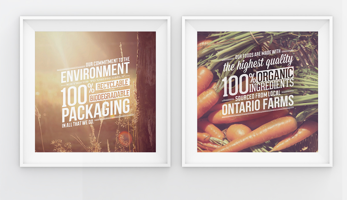
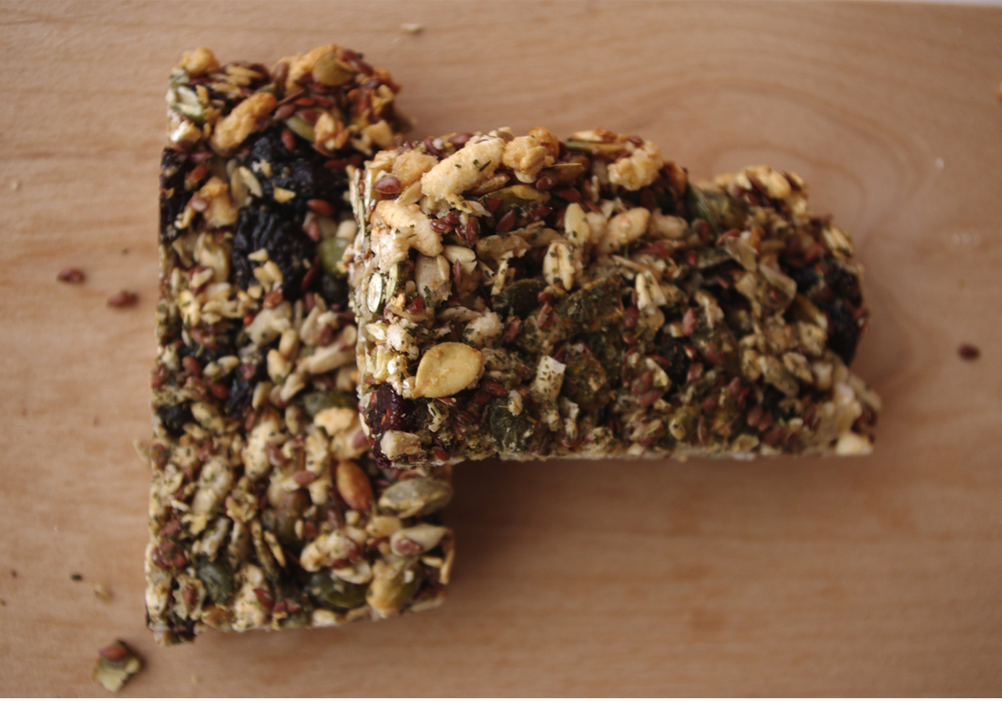
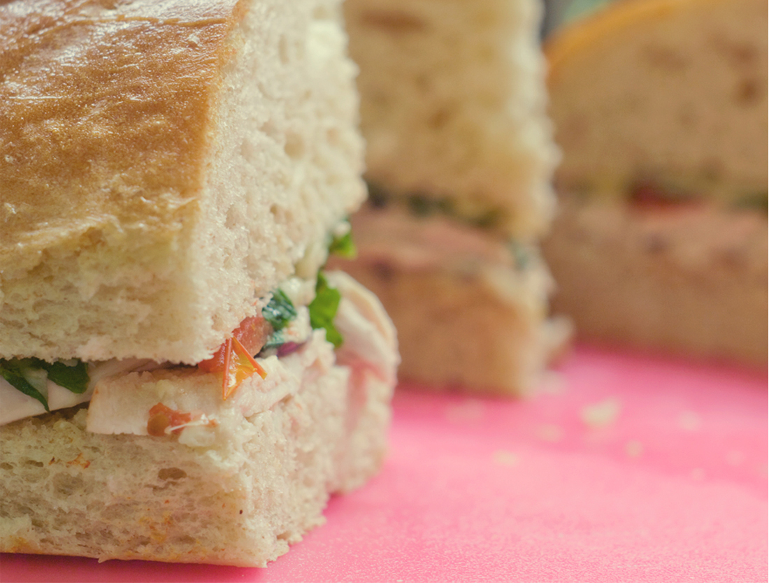
I also had the opportunity to do some food photography for Family First – a passion of mine that I don’t often get to do, let alone use in branding and marketing efforts.
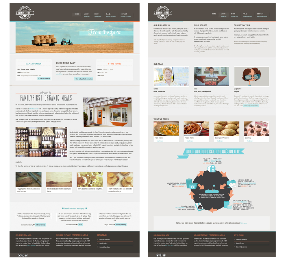
The new website was constructed with CSS and HTML, employing the use of slideshows, simple accordion tabs and an online ordering page.
Responsible for:
Brand Identity,
Package Design,
Illustration,
Print & Promotion Design,
Food Photography,
Website Design