
Family First Organic Meals
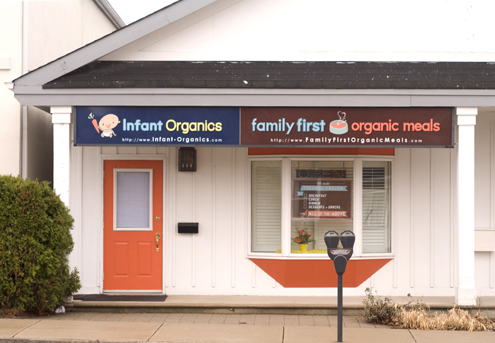
After opening Infant Organics and receiving a favourable response from parents, the mother and son team decided to expand their organic baby food business and create meals that the whole family could enjoy. A new brand was launched with a style and colour palette that complimented Infant Organics yet stood alone.
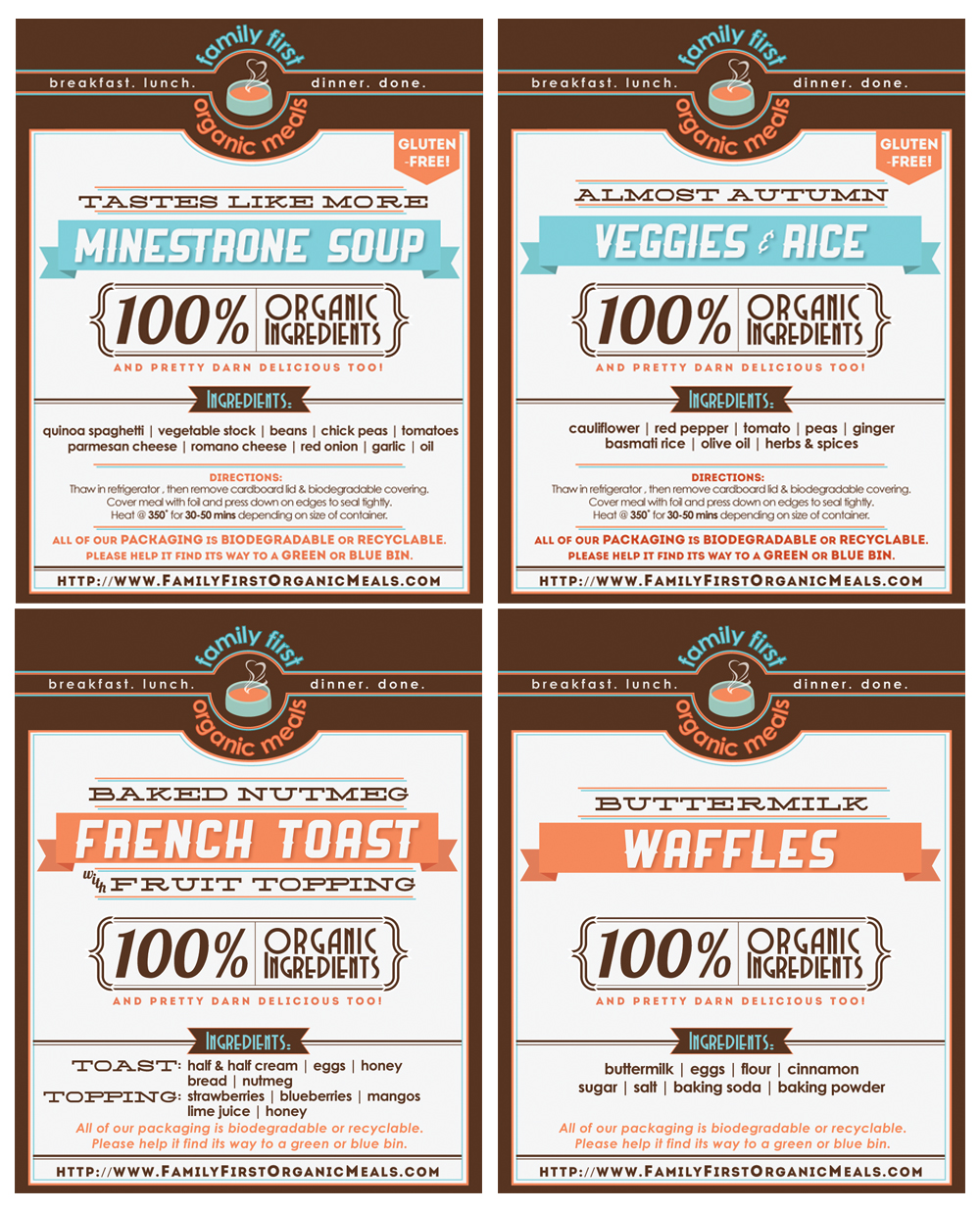
The overall look started with more scallops and graphics, but has since evolved over the year they’ve been open to have a more polished feel, incorporating the use of a darker, richer brown and retro-inspired fonts meant to instill feelings of nostalgia, and of a time when meals were still made from scratch at home and families sat down to eat together.
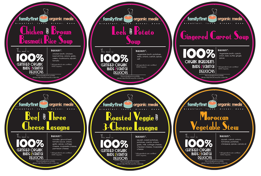
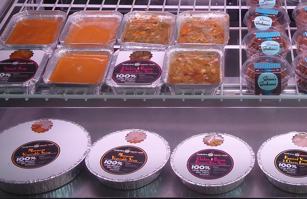
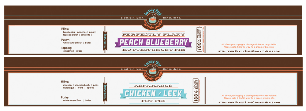
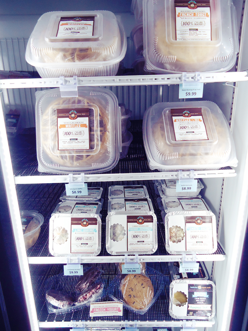
The food labels originally started out in a rich black with vibrant colour-coded labels – each type of meal (soup, casserole, etc.) adhered to a certain overall colour. The labels were all cut by hand which, as the company started to expand, proved to be too labour-intensive and time consuming. New labels were then created with the official colours and branding. Each was cropped to size and affixed to the various biodegradable and recyclable containers used. There were also bands designed specifically for pies which, after being sealed in biodegrdable baking paper, were wrapped around the entire item and sealed at the bottom which helped keep the paper closed.
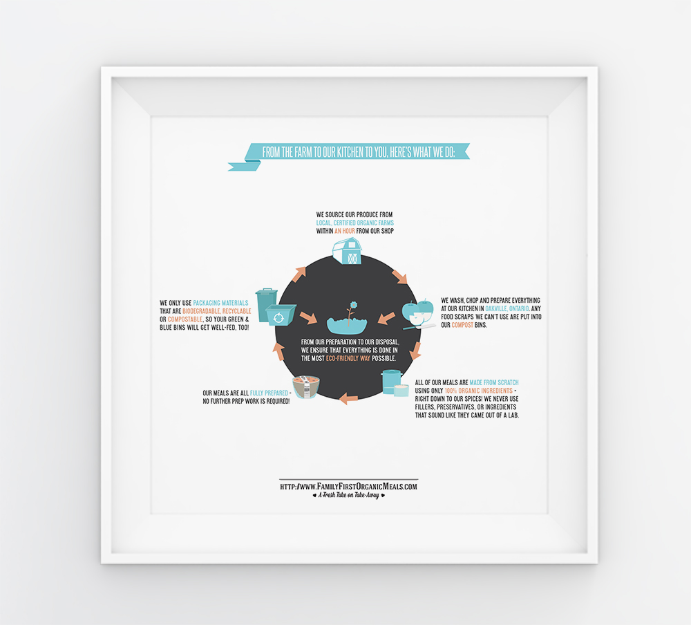
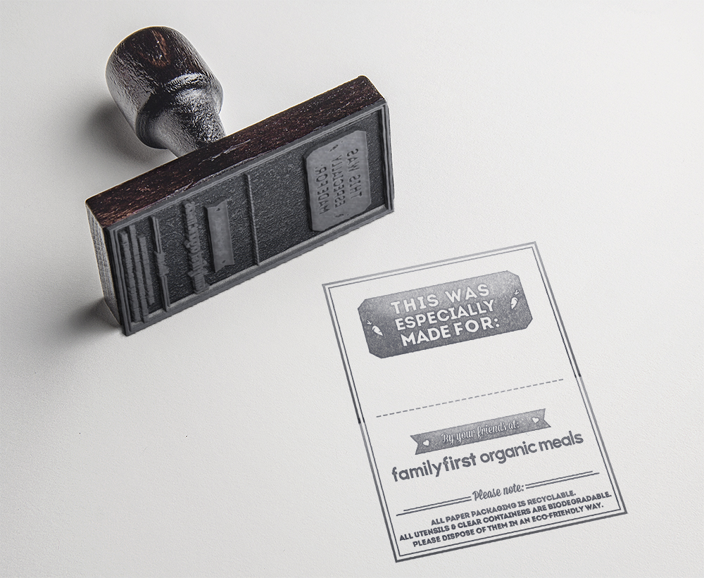
A print or ‘infographic’ was created in the company’s colour scheme illustrating the process by which their food is sustainably sourced, prepared by hand, and carefully disposed of. We also made a rubber stamp which was hand stamped on paper bags for custom orders and call-ins. The name was written on the dotted line area, and the bagged order was placed in a cooler until the customer arrived.
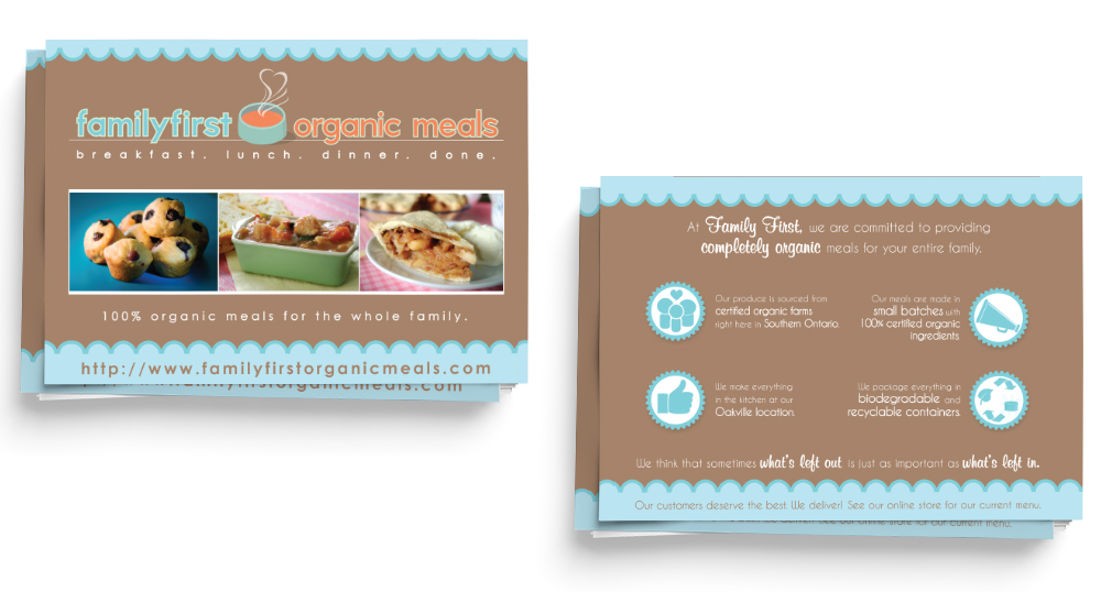
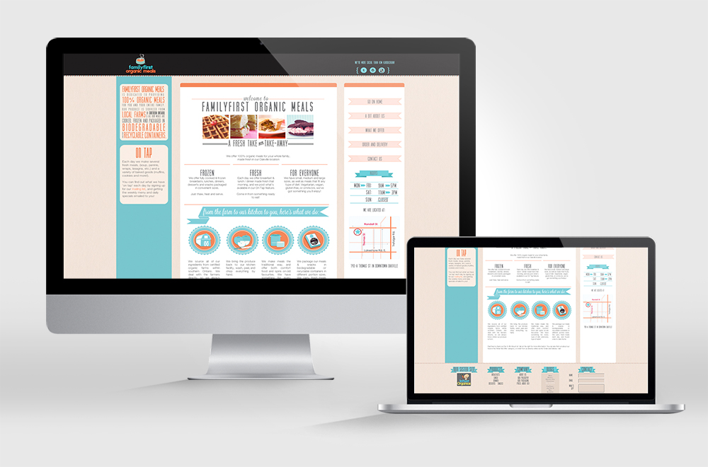
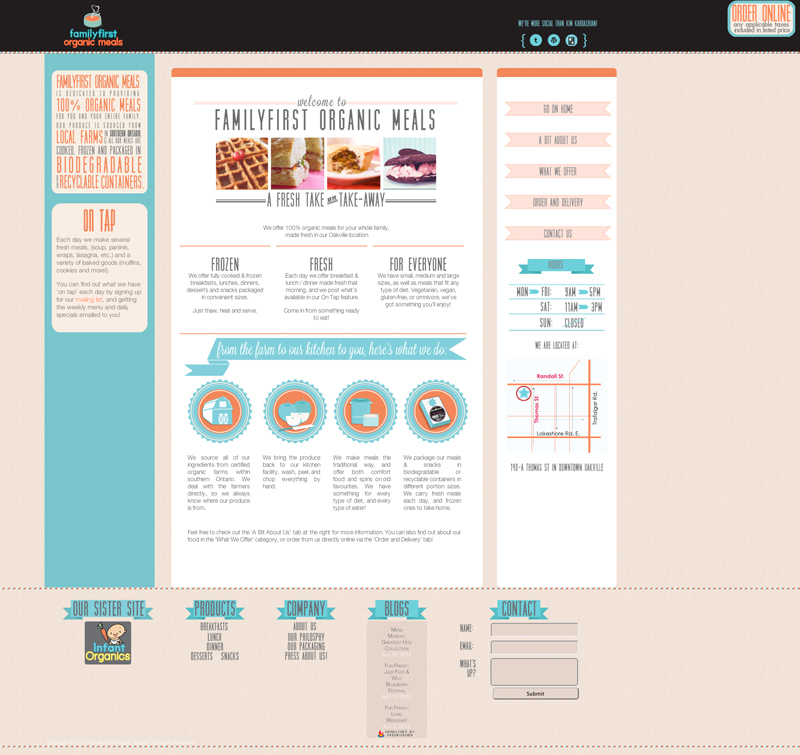
The website was designed to adhere to the overall brand’s aesthetic, using the colour palette and use of ribbons and banners seen in other print material.
Responsible for:
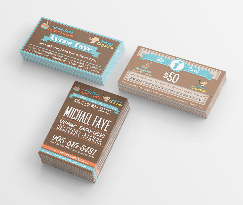
Brand Identity,
Package Design,
Illustration,
Menu Design,
Print & Promotion Design,
Food Photography,
Website Design